
A rock n’ roll legend in his own right, Canada’s Bob Masse has been creating highly collectible concert posters since the ‘60’s. As one of the pioneers of the psychedelic art movement, he has worked with everyone from Jimi Hendrix, Led Zeppelin, Bob Dylan, The Doors, and The Cream, to U2, The Red Hot Chilli Pepers, Tool, ACDC, and many more. His poster for U2 at the Reunion Arena has been listed as one of the top 10 concert posters of all time by Billboard Magazine.
It was great to get a chance to talk to Bob about his work and how he got started in this business.
I would like to thank Bob again for taking the time to do this interview.
Interview with Bob Masse

How did you get started in the entertainment business?
I was attending Vancouver Art School, and for our last year project, we had to do something that was“practical.” Basically, find a client, get a job, negotiate a price, get paid for it, and print it up. We had all this theory on how to draw pictures. So, now we had to draw a picture, try to paint it, put a frame on it and get it in a gallery. Sort of like a thesis I guess.
My best friend was in the same class with me and he had a cousin who was a beatnik. So we'd all hang out at an underground little coffee house near the art school and it was so cool. Just hanging out there basically lead to us producing some free posters for some of the folk acts who performed at this coffee house. We gave them free posters, and we got to hang out for free. Then another place opened in Vancouver, called Inquisition, and it was in a bigger, better location. We ended up doing the same thing: we'd have fun making posters for them and we'd get in for free. We were young, in our 20s, and just loved hanging out watching all the shows. So we did that for a while.
There was another folk club called The Bunkhouse coffee house that opened up in the early 60s. Because we’d do this stuff for free, we'd say, “Hey do you want us to do some promotional advertising posters for you?” So nobody would turn us down, but for us, like I said, we'd go backstage and hang out with Gordon Lightfoot, Ian and Sylvia, and Sonny Terry and Brownie McGee. All these people you’d get to meet. We were these young guys wanting to party. It was an obvious thing for us. It's very difficult as a young student to go to an advertising agency to get work. But going to the clubs, that was natural. As far as any young people wanting to start out, I mean, you can always go to a nightclub or talk to a promoter, they're always going to want advertising done. But they have limited budgets, so if you can do it for nothing, you can really start building up a good portfolio.
Then the folk music scene merged – it started going electric. For example, the Byrds, and Jefferson Airplane were originally folk bands. So was the Grateful Dead; they were a folk band called The Warlocks. But they and lots of others band were moving to electric. Then the scene somehow migrated over to Fourth Avenue, over to the Kitsilano area, where there was more of a hippie scene. Folk rock merged into the hippie scene. The big auditorium was the Russian community centre in those days. Again, I said to the guy, “Hey, you want me to do some posters for you?” I think I charged him ten dollars for the posters and so I got the job. I was still living with my parents at the time, so I had no real expenses, so I could do that. Because I was actually going to art school I wasn't expected to have a job. That's how I did it, just kind of fell into it that way.
Then that place, The Afterthought it was called, started bringing in bands like Steve Miller, Grateful Dead, Jefferson Airplane, who had a huge hit at the time with White Rabbit. A lot of the bands started becoming well known and so the crowds got bigger and bigger as time went on. It just sort of grew from there. I pretty well became the main poster artist in Vancouver at that time because I was always there doing it, I got very well known. But like anything else, you start out working cheap -- I think I was charging $10 to design a poster then -- and you have no trouble getting work.
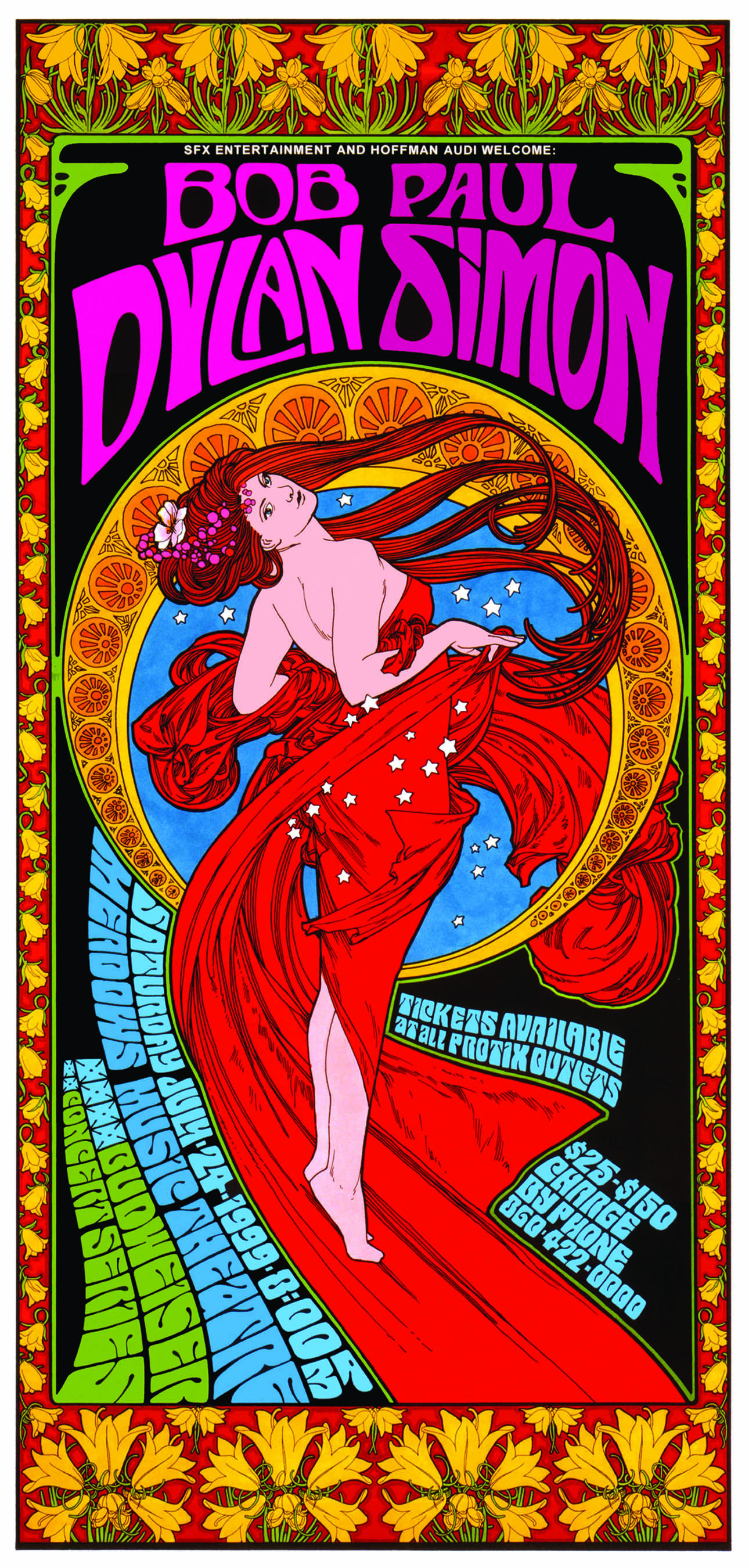
Bob_Dylan_Paul_Simon_fxd_copy
What is psychedelic art?
It started out from the old woodcut designs, they have that lettering, old early twentieth century stuff. The seed of that was from a place called the Red Dog Saloon in Nevada and with a group called The Charlatans (they became Big Brother and the Holding Company, and then Janis Joplin joined them). They had this Mississippi-gambler mock up in the way they dressed. Interestingly enough, at the same time over in England, they were doing the English Edwardian type of lace. It's kind of funny, because what was turn of the century stuff in America, they did a similar style in England going back in time a bit with the Edwardian dress.
But that lettering style, that old lettering was what was used. Then it started to bend and flow a little bit around, rather than keeping it totally straight. So psychedelic posters had lettering that flowed around a bit more. You were breaking a lot of the rules of design that you learnt so well in art school. That was what was so fascinating: you were breaking the rules. Here I am in art school learning everything should be parallel and flushed left; these guys were having the lettering flowing as part of the art. It wasn't just a photo with lettering, it was all one. The lettering became part of the art itself. Then, as different people came along and added their touch to it, different styles evolved. San Francisco was, of course, the place where psychedelic poster art was really taking off, so I'd go down to there every few months or so to see what the artists were up to.
The other thing about psychedelic art was the colour. The colours became very vibrant, bright and flashy. Some of the guys started really playing with the colours. So you've got a lettering style and then you've got colours: Two important factors. These colours would clash with one another and vibrate a little bit, like when you put primary colours next to one another.
Another part of psychedelic posters was that it was hard to read the damn things. It was kind of like if you were the in-crowd, you knew how to read these things, you didn't have to look very closely at them. People would be standing in front of the poster trying to figure out what the heck it was saying. It was great in the days of San Francisco because you'd walk down Haight-Ashbury and there were beautiful posters everywhere. I can remember those days, walking down to see what's the latest piece up on the street.
Why posters?
You know, it wasn't a conscious thing with me. I didn't decide I wanted to do this. I have always been an artist. I actually just fell into this. Well, there was no such thing as a concert poster artist anyway. But like I said, I fell into it. It was fun doing the artwork with the lettering. I think at that early age, I always had a desire to be an artist, but I didn't want to be a painter or a sculptor or a portrait-painter. I never really had that sorted out. It was just one of those things I just fell into and it just expanded and expanded.
Did you think this would become a career?
It didn't really. The early stuff I did wasn't anything I made a lot of money from. You see, the poster scene died out in the 70s, it didn't last very long. I had a whole period in Los Angeles in '68, '69 too. I did a couple of album covers and several posters while I was down there.
Does artwork play a part in bands' sales?
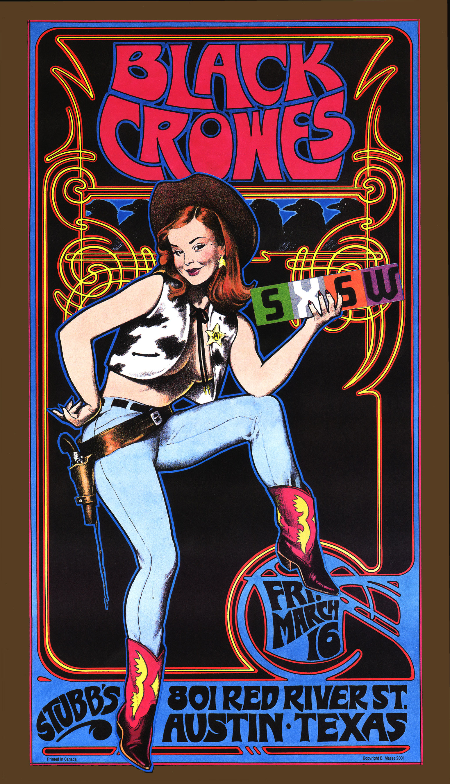
Black_Crowes_artofrock
The type of work that I did, when you're walking down the street, you're going to see this bright colourful imagery and you're going to stop and see it, so it's going to help a band from a promotional point of view, as opposed to an invisible little black and white something or other. So that's one thing, it communicates: “Oh this is for our generation, this is for our crowd.” So it has that association, that visual association.
The Grateful Dead was the most visual of all bands, they had a definite feeling and they did some wonderful things. They created a visual feast that went along with their music… plus, a party. So it didn't matter what they were playing on stage, you followed The Dead because it was a meeting of the tribes. It was a fabulous festival in the park, and that's what it really was. So it was more than the art.
Nowadays, there is something missing in the music scene. And that is the wonderful days of vinyl, when you had a nice big album cover to look at and read, what it had to say, the liner notes and so on. A cassette cover, it's got nothing to it. CDs have got a little more to them, but basically that's what’s missing.
Because people now download music for free, does that affect the role of music-related artwork?
Well, yeah. You have a different kind of scene happening now. Since you can't make much money on CD sales, bands have to go live more and then you become entered into the world of merchandise. So I'm getting calls from bands to produce a limited edition print, because they know my stuff sells. They want me to do a poster that's not necessarily a gig poster, but would be a band poster.
If you were given total artistic freedom, what would you do to increase a band's sale through art?
Many people told me, if you want to survive, try to get a niche market. Although, with most bands I've done work for, I've been aware and sensitive to what they were doing. Like when I was doing a lot of stuff for Jimmy Buffet, they were all nautical. Parrots, girls in the Southern beaches, bikinis, you know. I did a lot of work for Tori Amos. I used a lot of fairies. It was little fairies here and there. It was always still my style but I put little pieces in. Stevie Nicks, I'd keep the right colours, I'd give the right feel for her piece. I have that sensibility. Some bands, like Smashing Pumpkins keep their colours very dark, dark purple, black – You don't do a bright thing... Alanis Morrisette, when I did one for her it was all darkish tones. So I have a bit of sensibility of whom I'm working for. For String Cheese I did a real nice piece that had as its centrepiece this little young girl flying in on a dragonfly. It was a theme of theirs. There was a bit of an in-crowd theme. I had her on a dragonfly and there were all these little elves and nymphs dancing around her.
What elements do you think have led to you having such a successful career as an artist?
I think that my work is pretty; it's beautiful. It's very aesthetic. I always try to go and give a 110 percent. I like to blow people's minds. It's always been my thing. It's about people walking down the street that stop and go, “Wow, what's that?” I've never been shortcutting, or cheap or chintzy with my art. There are other poster artists that would crank something out in a day or so. But my policy has always been to go a little nutty. I mean, I'm creating a monster for myself. Sometimes this bloody stuff takes me 3 weeks to a month to do. Thank god for Photoshop. I've gotten into the computer now, which has saved my ass. Because my stuff is too time consuming.
How has the Internet and the digital world affected your line of work?

TOOL-SEND-1
Oh, tremendously. I deal internationally now. I've been able to move away from Vancouver, which was a matter of having to be close to advertising agencies, customers and design studios to get work. I would feed off them. That was where I got my work as an illustrator – designer. All my communication is all on-line with people, internationally now. So that's been the best thing that way. The second thing is Photoshop. I’m starting to do a lot more with Photoshop now. Wow, does it ever save time. I quite love Photoshop once you really get to work on it. So my whole way of operating is quite different now than before
Like this piece I'm currently working on. I did a female figure in two parts because I have an 11 X 17 inch scanner, which is a big scanner. I got to put the image of two 11 X 17’s, then I'll scan them and cut and paste it to put the two together. Then with the background, it's kind of a big circular mandala. Well, I just do half of it. Then scan it in and do the flip, otherwise in the old days I'd have to paint the whole thing. I do the same thing with the borders. Well, actually I'll do part of a border, make a copy, paste it down and then make a copy, flip it and so on. That would have taken me a week to do before. My old stuff used to be all black and white line outlines. I did large Xeroxes, big photocopies. I'd get there with my felt pens, my watercolours and I'd sit there colouring the thing in. There was a point where I realized, hmm, maybe if I just make a colour photocopy, go to the place, make ten colour photocopies, I could cut them and paste them along. Because I had started getting busy, I just couldn't spend the same amount of time anymore.
In the old days, I didn't have any work really, so I'd sit there and spend three weeks working on a piece. I was more of a fine artist in those days. I didn't do commercial art at all. I would just produce a poster, and then I'd put it up on the network. I was lucky enough to have people buying that stuff. I could print up a thousand, then unload five hundred right off the bat, so I get my money back for the printing and all that. I just got too much going on now.
So the digital world is a good thing then?
Not really. I enjoyed the old days. For an artist, it's nice to spend three weeks on the same piece. I quite enjoy getting wrapped up in that. I knew exactly what I wanted to do.
Another thing about the concert posters, I don't know if I mentioned this or not, but the thing I liked about it was it was very much like fine art, I could do whatever I wanted. Somebody wasn’t saying, “Our band is this way and we want green only and we want it like this or we want it like that.” I could just do whatever I wanted. It’s always been that way with the poster scene.
In the early days I used to do some of the strangest images. To think of it now, what was I doing? If you take a look at a lot of the early San Francisco posters, the artwork had nothing to do with the band, really. It was just the artist tripping out doing his thing and then you just put the words Grateful Dead on top of that. These San Francisco guys were making about a hundred bucks a poster. I would make it ten bucks a poster, so when you do it like that, nobody is going to tell you what to do. You're doing it for cheap, you do whatever you want. It’s not costing me anything, go ahead and have some fun kid. (Of course, it's easy if you're still living at home!) But that was also a trippy thing about the concert posters. You just do whatever kind of art you were interested in at that particular time. It's more fine art.
What about Alphonse Mucha?

afterthotyelowgreen_copy
Oh, I just love his work. It's one of those things. See I don't really have any great philosophical message that I'm getting out there. I’m just enjoying myself, having fun. I've always loved Mucha’s work. I enjoy doing it. A lot of the time I was just tracing on top of his work. Like I said, you get shit for doing that in the fine art world, but for a concert poster it doesn't matter. With me, I’ve just been having fun doing what I enjoy. So I really worked quite a Mucha stage. I'm very much into turn of the century illustrator-art nouveau stuff. I sort of feel that I’m turning people on to it. People never see this kind of art, it's hidden away in old books. I like to turn on a whole new generation who has never seen this stuff before.
I went to Prague a couple of years back and went to the Mucha museum. I love his work. It's just one of those things. There’s a couple of people I really like, I like Maxfield Parrish quite a bit, Norman Rockwell I really love. I like real craftsmen, people who could really, really draw. Norman Rockwell is an amazing draughtsman and I really admire that because I am very much a technician.
Do you feel there is a connection between Art Nouveau and psychedelic art?
Oh yeah, there was. At the time they were doing the art nouveau period, the hippie and the psychedelic period was very parallel. This was a bohemian revolution against the uptight previous art world they had, breaking a bit of the rules. Then you’ve got your impressionists, you’ve got your cubists. So that was a scene. Art nouveau was an organic type of art, it was all bending and flowing. It wasn’t so much straight lines and tightness, it was actually considered a craft. A lot of art nouveau stuff is in furniture, architecture. That was when they started promoting concerts and clubs with these big posters. They'd be 6 foot posters, like two pieces of paper glued together. You can imagine walking down the streets of Paris and they've got these big beautiful things hanging up around the city. So they started to use the poster as an outdoor form of advertising.
When the hippies started doing it in San Francisco, they started using the style that they did at the turn of the century in Paris. That's what caught on. This was like a second bohemian revolution. Also the organic-ness of art nouveau worked well with the organic people. The flower people were more organic in thinking, with the earth tones…it’s got all that same elements.
I've always been interested in art nouveau. I found a 1910 sign painters manual with all these different lettering styles and different border treatments, it was very unique artwork for me. Even when I was a kid, I was like “Wow this is amazing stuff.” So that’s basically it.
You can visit Bob at the OLIO Festival in Vancouver 23rd-26th September 2010. Learn more here.
